
 Packaging design and packaging production
 Advertisement design services
 Advertisement video
 Sales & marketing lottery management
  Product photos
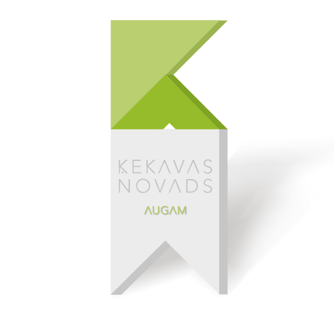
 City visual identity
 Supermarket newspapers


Nowadays public administration is changing its focus to providing business-like customer service, thus having a unified visual identity of a city or municipality is more important than ever. Local municipalities are extending their functions and new departments for sports, cultural, educational institutions, municipal companies, etc. are formed. Because of it, there is now an extensive amount of visual communication in digital, printed or other media. The distribution of state funds between cities and municipalities are motivating local governments to introduce a customer (resident)-oriented service.
Today, the visual identity of a municipality is more than just a logo and coat of arms. It is a story that is explained with graphic signs. It involves both a colour and symbol explanation and brand usage guidelines.
The visual identity of Kekava municipality was formed considering its main value – “Growing county”- which was used to build both the graphic sign and its explanation. Kekava is a rapidly growing municipality. It has established the right environment for development and is continuously improving it. Therefore, the word “Augam” (translation: “Growing”) was chosen as the best option for the slogan, which not only describes Kekava as a developing municipality but also sets high expectations for each significant work accomplished – to do everything possible to ensure continuous development of the municipality.
The new standard is easy to adapt and use, for example, entrepreneurs and domestic producers can use the new logo of Kekava municipality together with the slogan “Radām” on their product packaging. Graphic standards also give more freedom in designing printed and digital materials, freely using stylized K-shaped colour elements and styles, and strictly regulating only the proportions and shapes of the logo itself.
The process of developing a municipality graphic sign and the brand book is not fast – it takes at least 6 months of work and involves both parties. In our experience, the best model is the formation of the municipality or city council employees, consisting of marketing and communication specialists, representatives of cultural and art departments, and the management of the council. To ensure a more objective result, it is also recommended to involve an independent specialist, who monitors the whole process.
- Graphic identity content;
- Logo with colour codes and sizes;
- Coat of arms and its usage guidelines together with the logo;
- Use of the primary colours and additional colours;
- Fonts for official documents and advertising materials;
- Corporate materials – document design, diplomas, presentation design, email signature, business card, instructions;
- Visual materials – environmental objects in the municipality, transport design, flags, sports forms, internet.
Whatever the graphic identity of the city is, the actions that strengthen it are the most important. Only real actions will prove the promise of the brand. Only action will make it strong and influential. A brand is not a noun, it’s a verb!
Click here to see the new graphic identity of Kekava municipality developed by SprintLab: ej.uz/kekavasnovads_zimols.
We develop the graphic identity and brand strategy of the municipality, cooperating with professional graphic designers, brand and marketing experts.